
Hi friends of Perfect Chaos! For the last few months I’ve been working hard on project managing all aspects of the creation and production of a new book. This will be my third book (or fourth if you count the eBook I released last year).
In this post I’m going to show you the finished cover art for the book, designed by a lovely chap who works for Bloomsbury Publishing but who fortunately takes on some freelance projects in his spare time.
I thought it might be interesting for you to see the process that we went through, from my original idea to the various concepts we discussed, and then finally the finished design.
So let’s start at the beginning, and I’ll walk you through how the process unfolded.
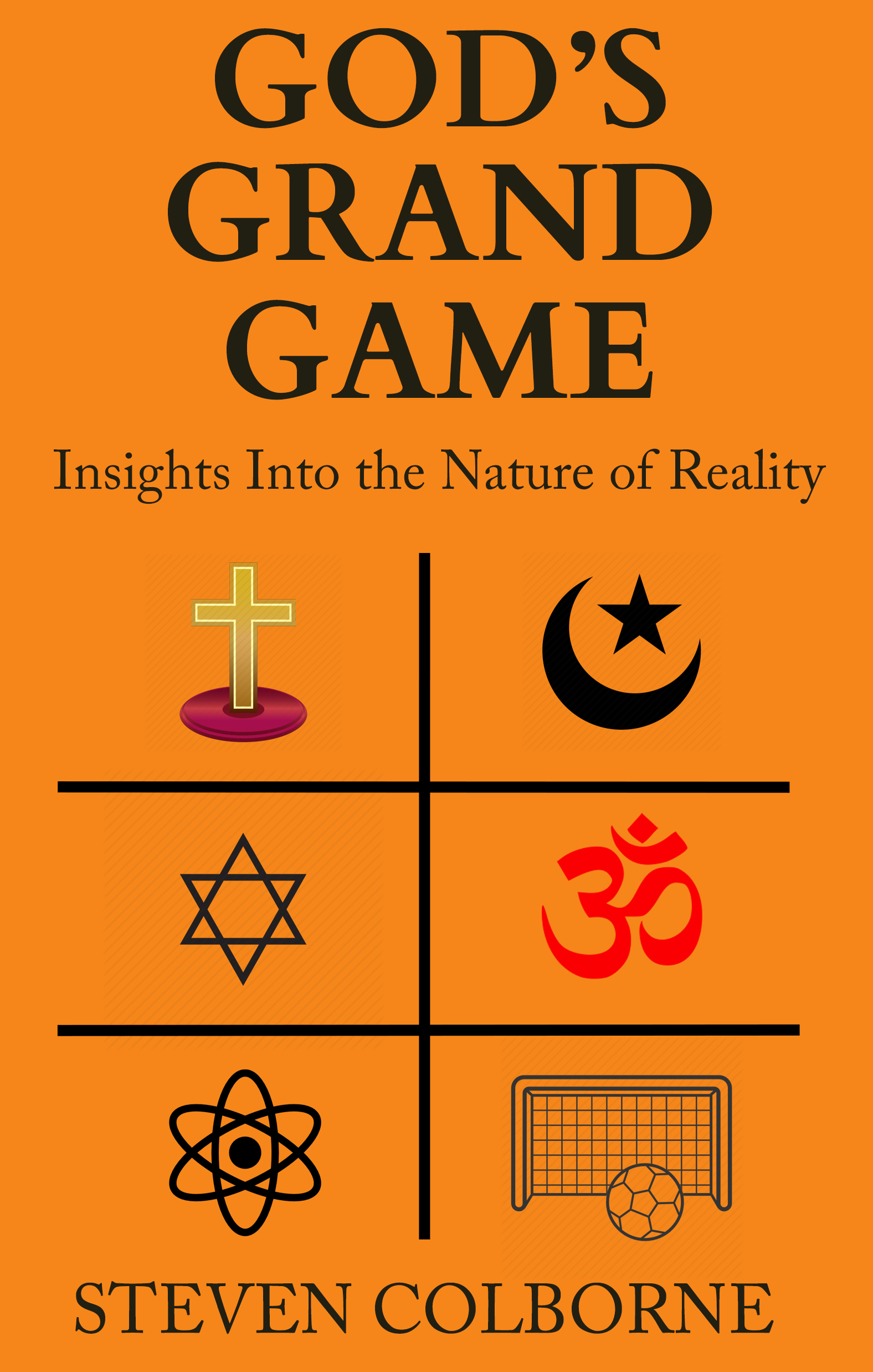
My Initial Idea
The main theme of the book is that the whole of existence is a grand performance orchestrated by God. With this very rough initial design, I wanted to communicate the fact that God is in control of all religions, as well as science. The football and goal are included because God is also in control of all the playful everyday aspects of existence.
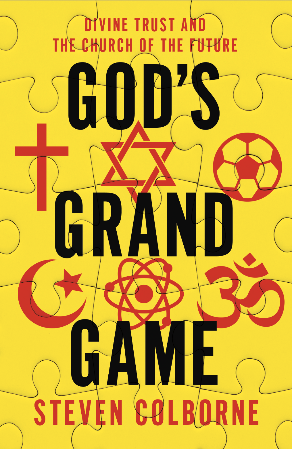
My Designer’s Initial Idea
My designer came back to me with the following rather playful design. He felt the puzzle effect might work well with the ‘game’ idea. I liked it, but felt the design was a bit too ‘childish’ and asked if we could perhaps go for something that would feel more like an ‘adult’ book.
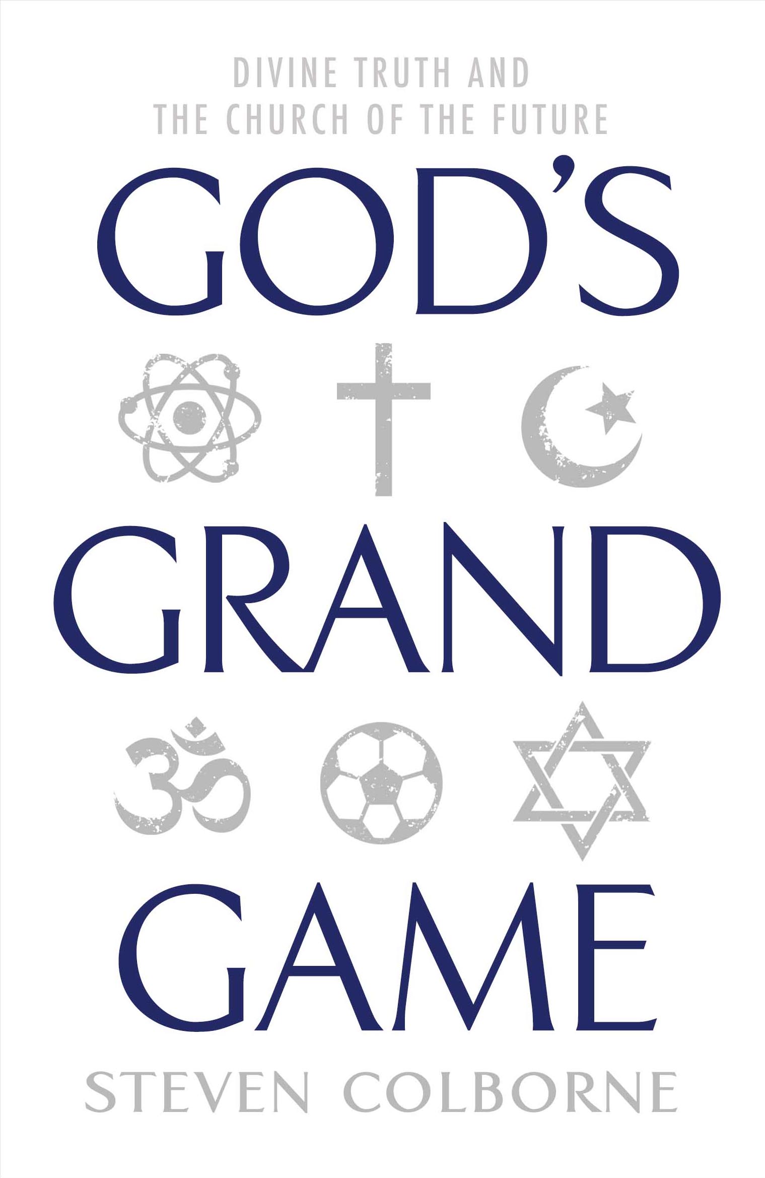
A More Adult Feel
My designer came back to me with this lovely design, and this is where the cover really started to take shape. I really liked the aged feel of the symbols, and the colours and simplicity really appealed to me.
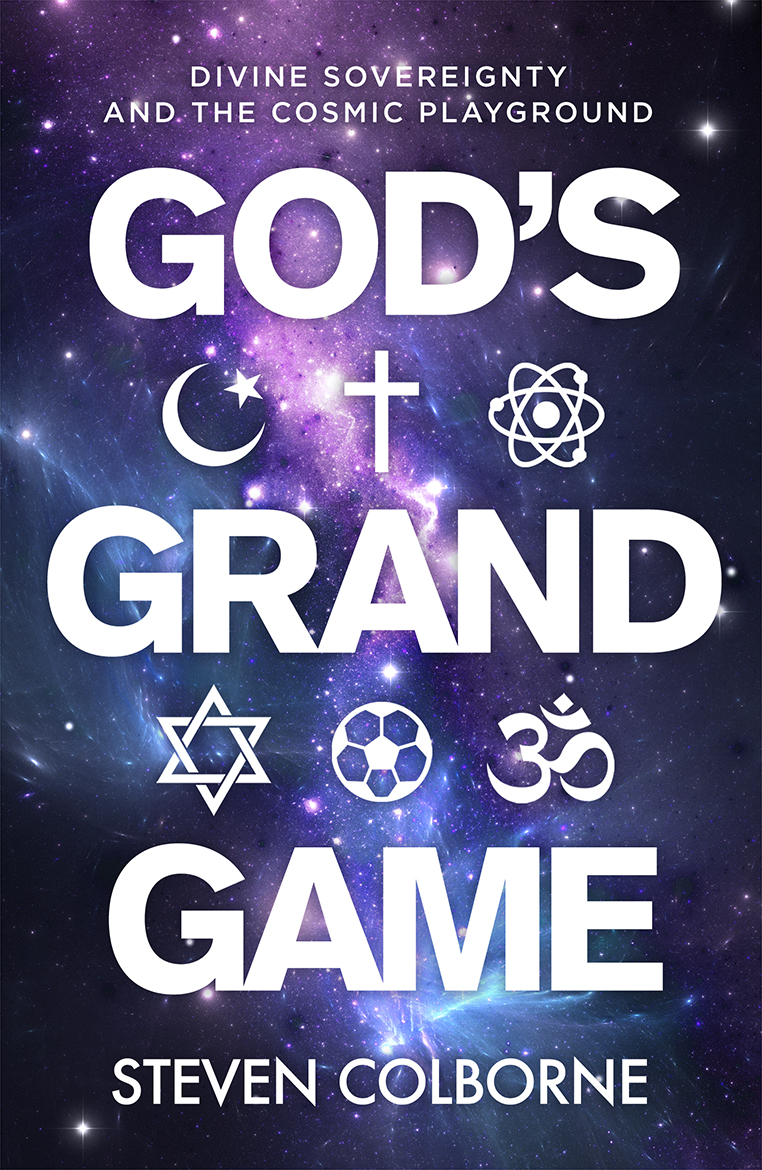
The Cosmic Style
I decided upon a new subtitle, and suggested I might like to see some ideas that were a little more ‘cosmic’ in feel. My designer got back to me with this idea, which I thought was great, but it looked somehow too ‘new agey’ for me, and I felt it might appeal less to my target audience.
We’re Nearly There
When I saw this design I started to get very excited, because this is professional and slick, while also incorporating all of the elements from the other designs that I liked. I said I liked it, but that it would be nice if the design incorporated the aged symbols like on the white design above.
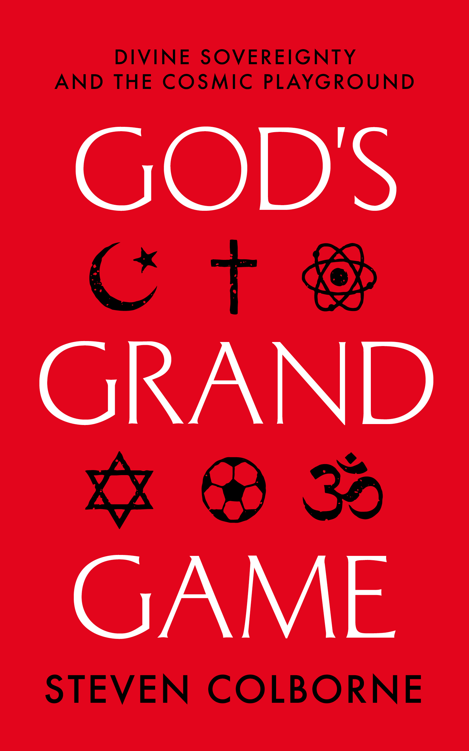
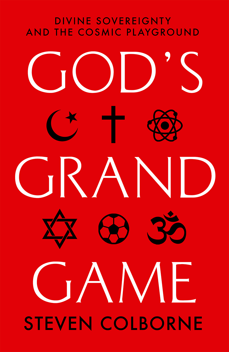
The Final Design
The finishing touch was to incorporate the aged feel of the symbols into the design I liked. It’s quite a subtle effect, but I think it will look good on the physical product, once the books have been printed. The cover is serious but also has a playful element, with the football providing a little humour alongside the gravitas of the religious and scientific symbols. Oh, and the all-important apostrophe is improved!
God’s Grand Game is tentatively scheduled for release in March 2019. To read the blurb for the book click here. I will keep you posted regarding the release date and where you will be able to buy the book, but if all goes to plan it will be available worldwide through Amazon and a range of other retailers, in paperback, hardback, and eBook formats. To be notified of all news related to this release, please subscribe to my email list.
Do you like the cover? Let me know in the comments below!


26 responses to “My New Book: Title and Artwork”
Love it, well done!
LikeLiked by 1 person
Cheers, Ryan! 😁
LikeLiked by 1 person
Great cover, Steve. It is very simplistic and clean with eye pleasing colour. I like the white version of this one too. White background looks quite peaceful with the word God on it. But the symbols may need dark font to catch the attention. However, this isn’t the case with Red. Nice selection, finally !
Also best wishes for this new book 👍🏼
LikeLiked by 1 person
Hi Mani! Great to hear from you and thanks for the feedback. I appreciate your comments! Glad you like the final one we chose. I was a bit worried it was too simple… but I think (hope!) that the religious symbols provide enough interest for it to be effective 😊
LikeLike
I love the final result, and I enjoyed seeing how that developed through the different ideas!
LikeLiked by 1 person
I’m so glad, Lily, thank you. That’s really encouraging! 😃
LikeLiked by 1 person
I like the cover. It may say a lot about me, but the puzzle cover is probably the one I like most. Although the final design is great as well. Funny how different things appeal to different people. Also love me a good discussion on reality, so looking forward to the read!
LikeLiked by 1 person
Hi there! Yes, these things are subjective (which, funnily enough, is a theme covered in the book 🙂 ). Thanks so much for reading the post and leaving your thoughts!
LikeLike
That’s awesome! Congrats
LikeLiked by 1 person
Thank you very much! 😁
LikeLike
This was a very fascinating insight into the front cover design process. Good work!
I will keep it in mind if I ever write a book not to stop at the first draft (and hire a designer haha!).
LikeLiked by 1 person
Thank you, Pece! Yeah I would say hiring a designer is an essential part of the self-publishing process 😁 Thanks for following!
LikeLiked by 1 person
How exciting!
LikeLiked by 1 person
Thanks Jessy! I appreciate you sharing in my excitement! God bless 🙂
LikeLiked by 1 person
Likewise! Wishing you much success! 👐
LikeLiked by 1 person
Good stuff brother.
LikeLiked by 1 person
Many thanks! 🙂
LikeLike
This looks really, really good, Steven. Also, congrats on your new book.
LikeLiked by 1 person
Thank you so much! 🙂
LikeLike
Cannot wait to read it. Gees, I thought I was alone.
LikeLiked by 1 person
Thank you KT! That’s very encouraging. It’s good to be connected 🙂
LikeLike
Yes. I’d absolutely love to share thoughts. I’ve felt like I was shouting into the ether…
LikeLiked by 1 person
Do you use the WordPress Reader? That’s how I discover like-minded bloggers. You can search specific tags. Sorry if I’m telling you things you already know/do!
LikeLike
I do. And no need to apologize. Spread the word. Feed the world. We all need to accept diversity and cooperate. We have a planet, no a galaxy, no one hundred billion galaxies at our disposal.
LikeLiked by 1 person